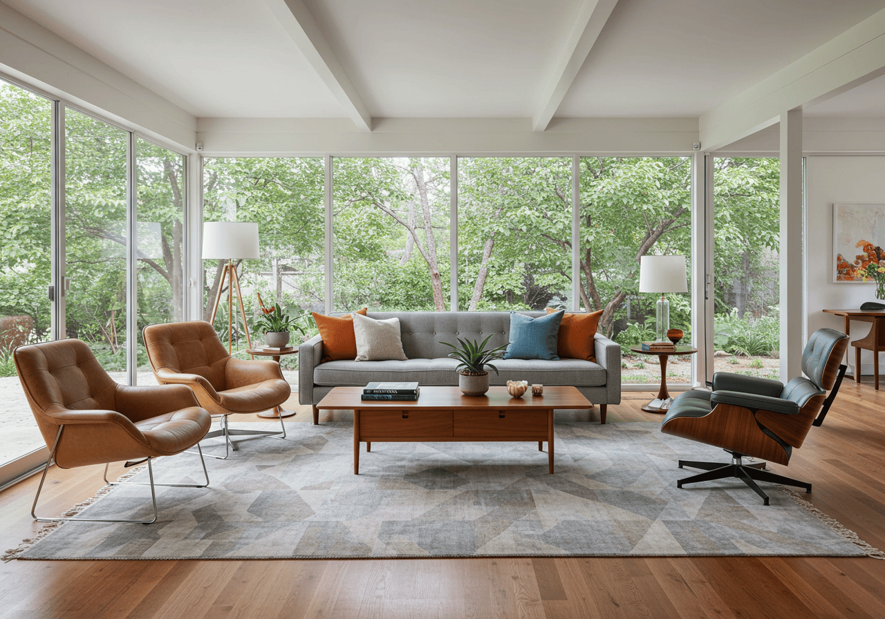
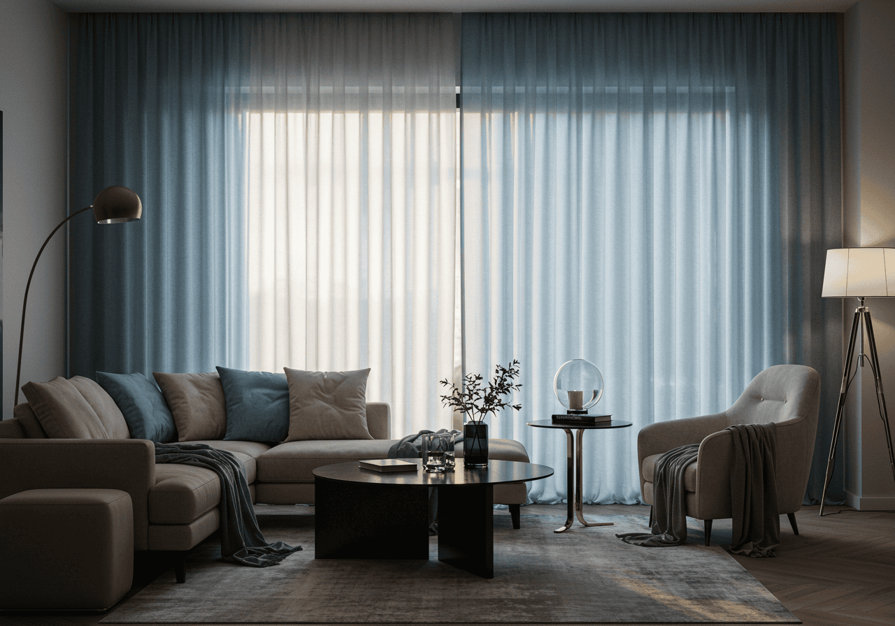
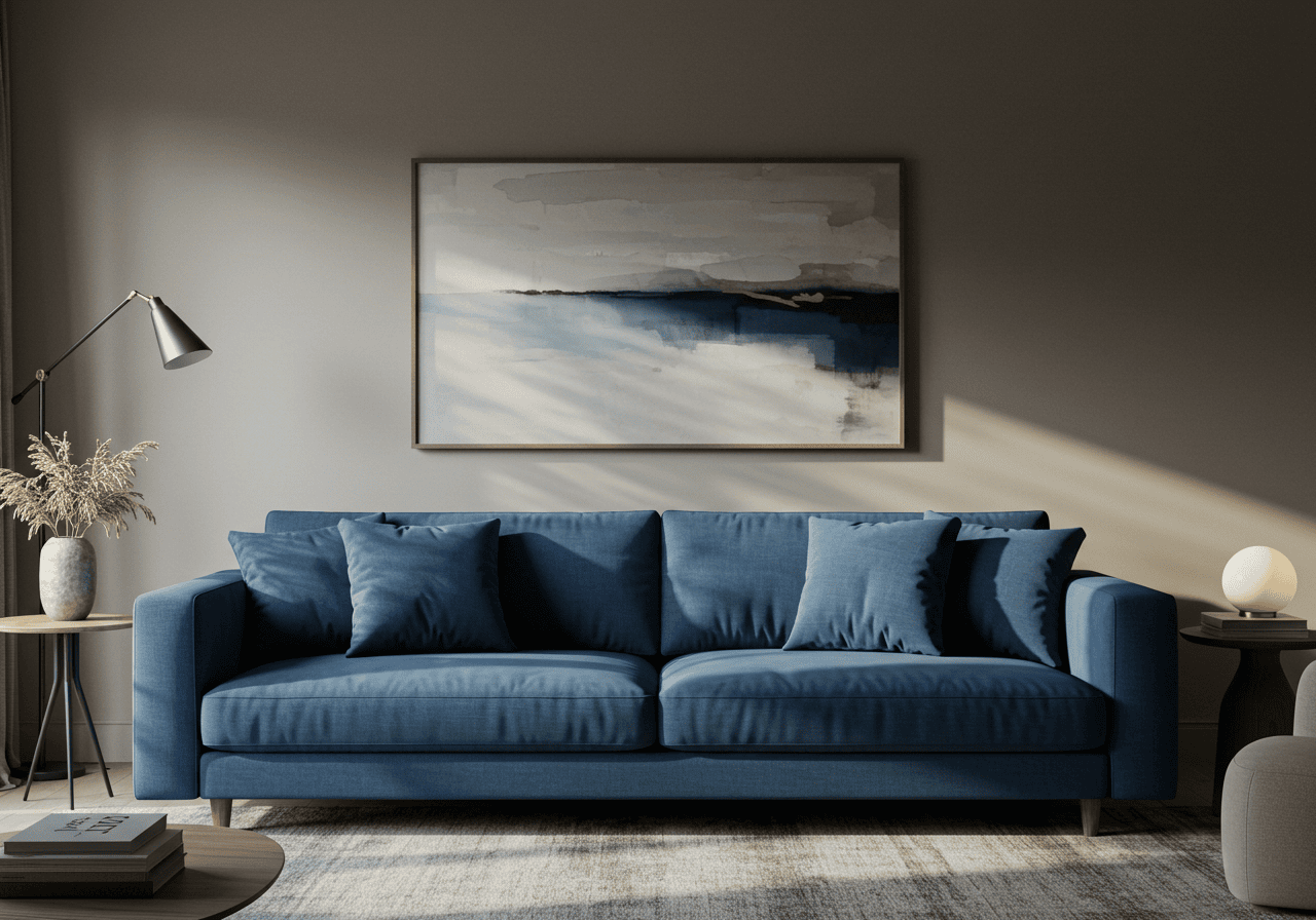
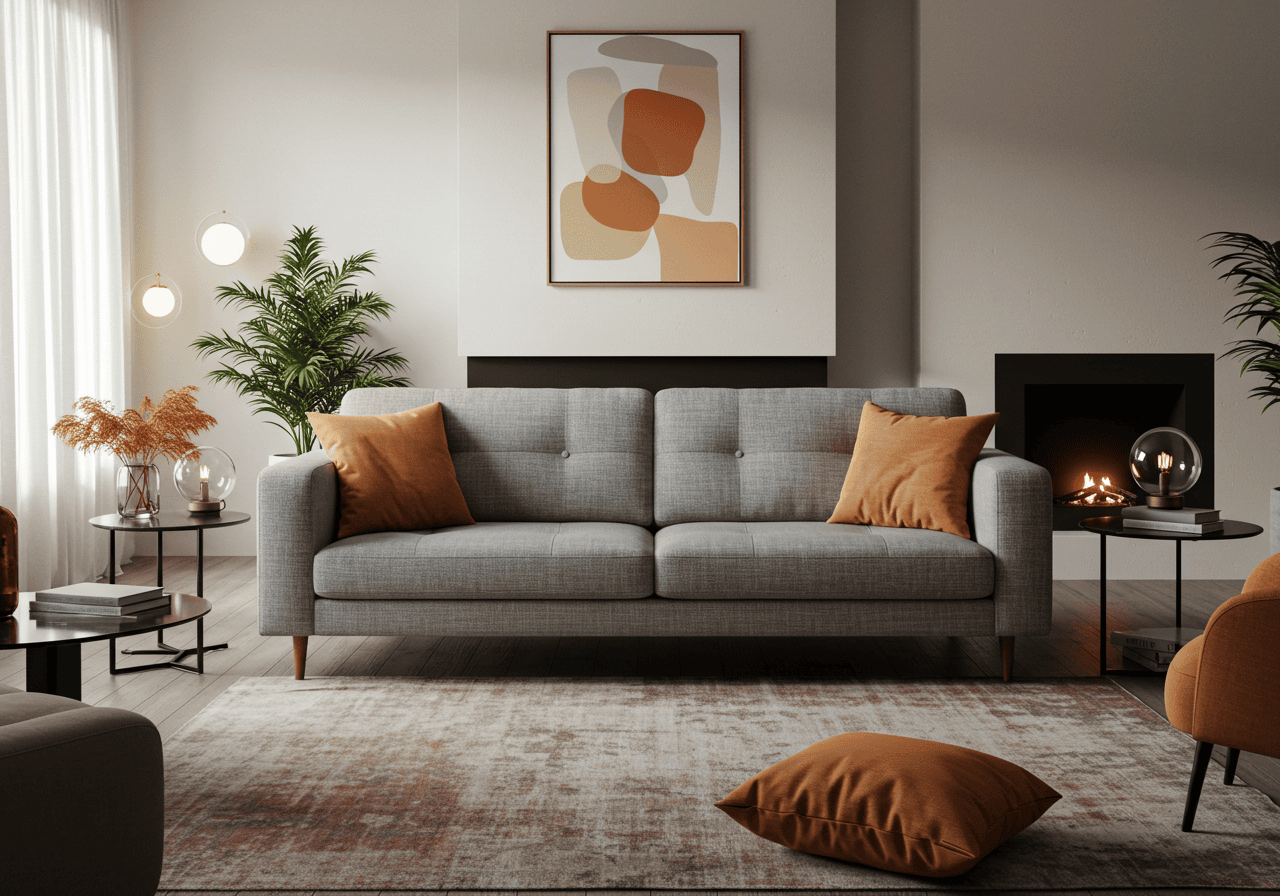
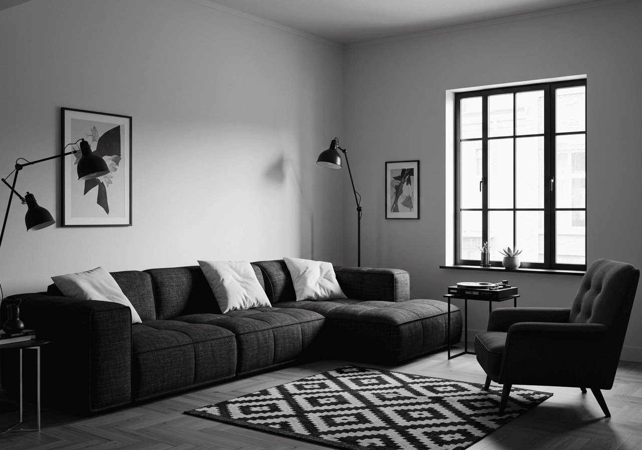
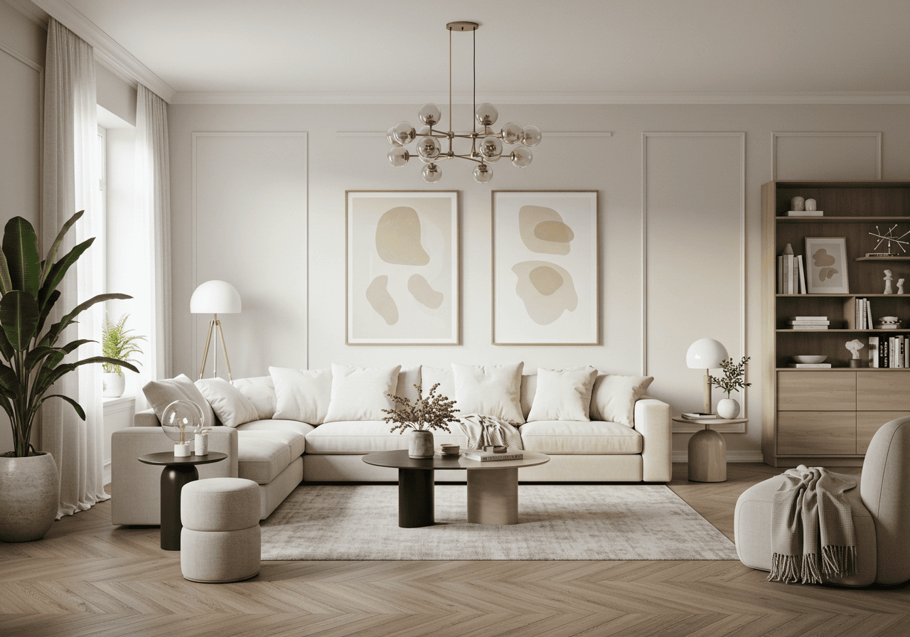
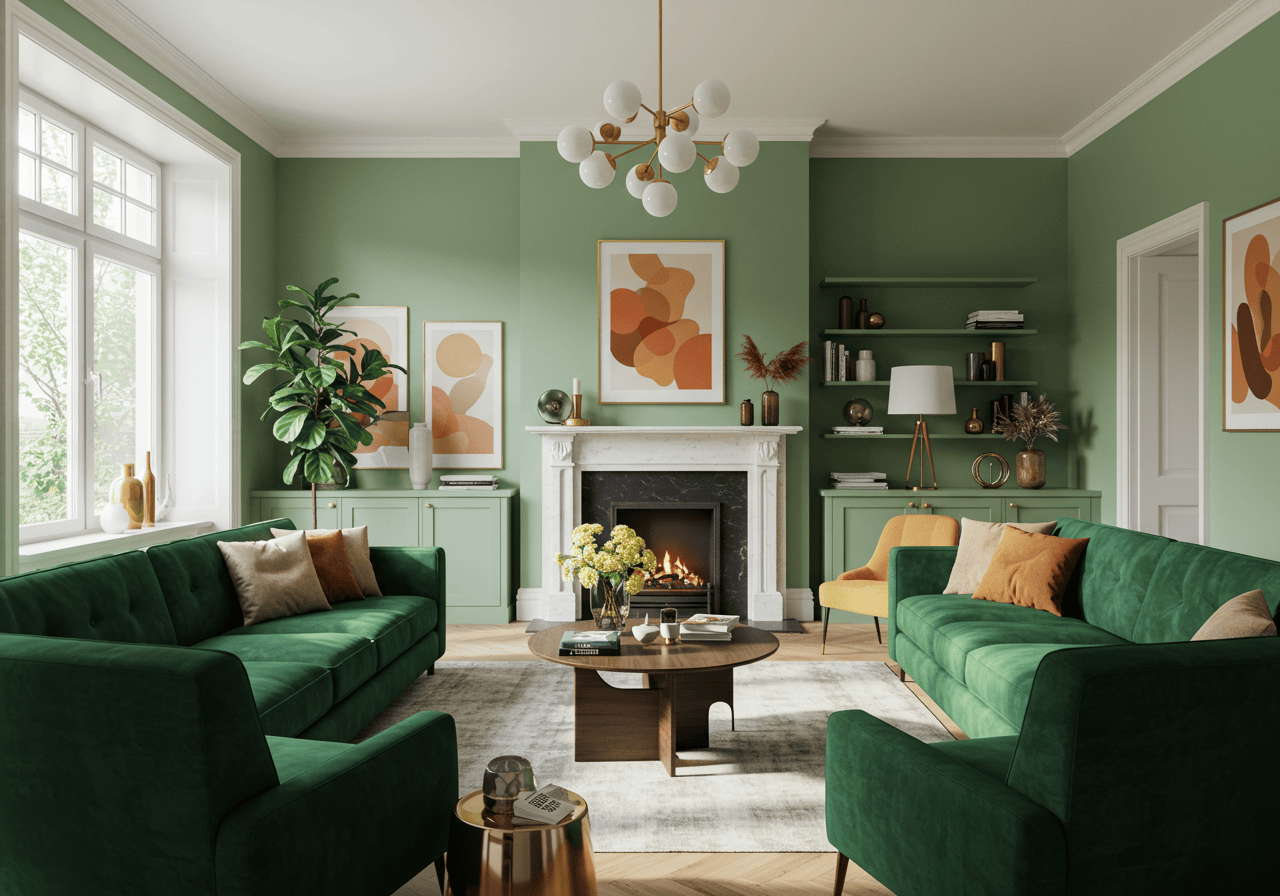
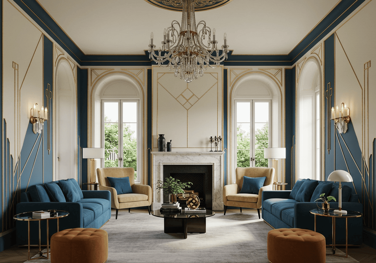
Hey there, home lover! Ever walk into your living room and think, “It’s nice, but… it could use a little oomph“? Sometimes, that missing ingredient is simply color! Moving beyond beige doesn’t have to be scary. In fact, adding vibrant hues can totally transform your space, injecting personality, energy, and warmth.
Forget bland and boring. We’re diving into a rainbow of possibilities with 21 colorful living room ideas designed to inspire. Whether you want a subtle blush or a bold statement, we’ve got practical tips and trending looks to help you create a living room that truly feels like you. Ready to brighten things up? Let’s go!
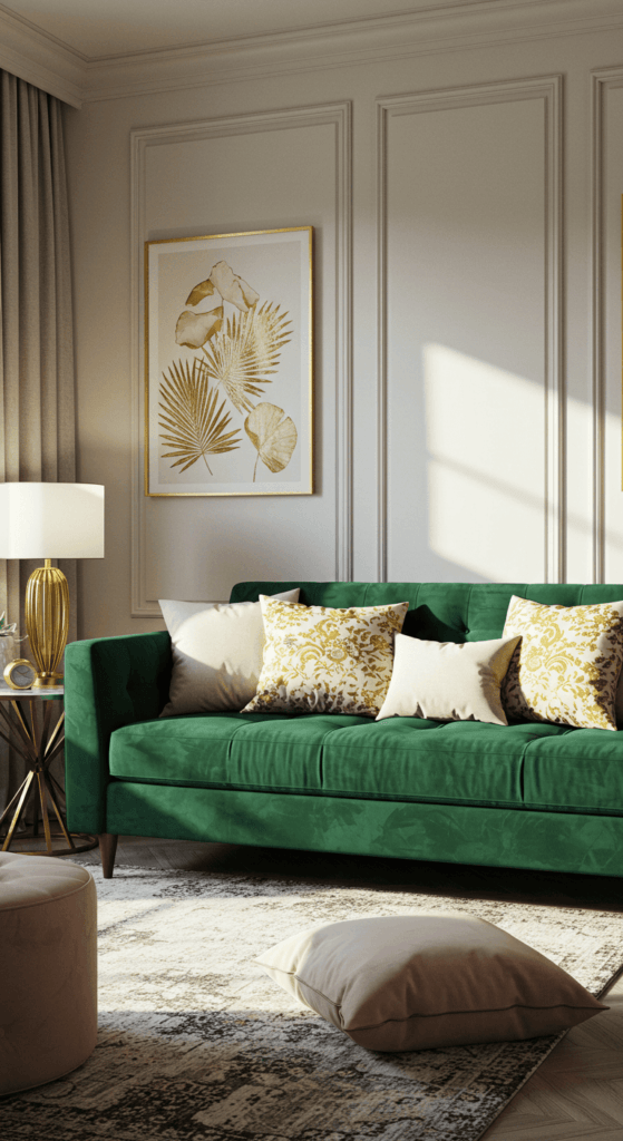
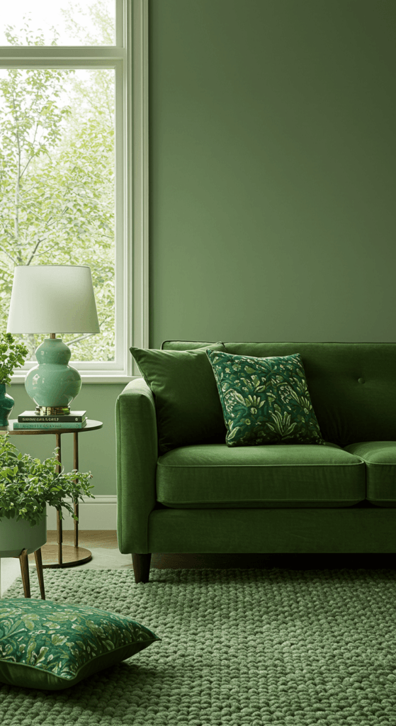
1. Go Bold with a Jewel-Toned Sofa
Think sofas only come in shades of grey and beige? Think again! A richly colored sofa in a jewel tone like emerald green, sapphire blue, deep ruby, or plush amethyst can act as the stunning centerpiece of your entire room.
- Why it works: It’s an instant focal point that screams sophistication and confidence. It anchors the room and provides a gorgeous base to build your color palette around.
- Expert Tip: Balance a bold sofa with neutral walls (think soft white, warm grey, or even a muted complementary color). Pull accent colors from the sofa for cushions, throws, and artwork. Consider luxurious fabrics like velvet to really enhance the richness of the jewel tone.
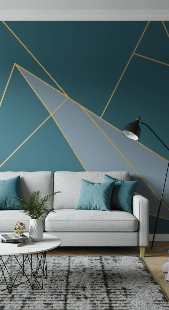
2. Paint an Accent Wall (But Make It Interesting!)
The accent wall is a classic for a reason, but let’s elevate it beyond just one solid block of paint. Think color blocking, geometric patterns, or even a feature wall with vibrant wallpaper.
- Why it works: It adds depth and visual interest without overwhelming the entire space. It’s perfect for defining a specific zone, like behind the sofa or around a fireplace.
- Unique Insight: Don’t just pick any wall! Choose the one your eye is naturally drawn to when you enter the room. For geometric patterns, use painter’s tape for crisp lines. Consider a high-gloss finish for extra drama, or a matte finish for a modern, sophisticated feel.
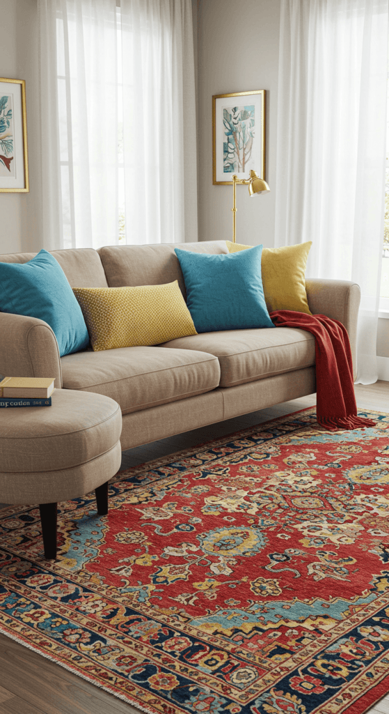
3. Weave in Color with Rugs and Textiles
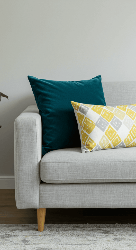
Perhaps the easiest way to flirt with color? Through textiles! A vibrant area rug, colorful throw pillows, and eye-catching curtains can inject life into a neutral space without long-term commitment.
- Why it works: Textiles add color, pattern, and texture, making the room feel cozy and layered. You can easily swap them out seasonally or when you fancy a change.
- Styling Tip: Start with a multi-colored rug you love and use it as your palette guide. Pull 2-3 colors from the rug for your cushions, throws, and artwork. Don’t be afraid to mix patterns – just vary the scale (e.g., one large floral, one small geometric, one solid texture). Considering window treatments? Check out these gorgeous curtains ideas for living room for inspiration on how they can contribute to your color story.
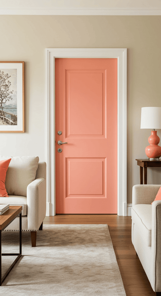
4. Surprise & Delight with Unexpected Color Pops
Sometimes, the most impactful color comes in small, unexpected doses. Think painting the inside of a bookshelf a bright hue, choosing a vibrant lampshade, adding a single colorful accent chair, or even painting your internal doors.
- Why it works: These surprising pops create focal points and add a playful, curated feel to your decor. They show personality and attention to detail. It’s also a fantastic strategy if you’re working with limited square footage, as highlighted in these living room designs for small spaces.
- Clever Idea: A brightly painted side table next to a neutral armchair, or vibrant coasters on a coffee table, can be just enough. This approach is perfect for renters or those hesitant about large color commitments.
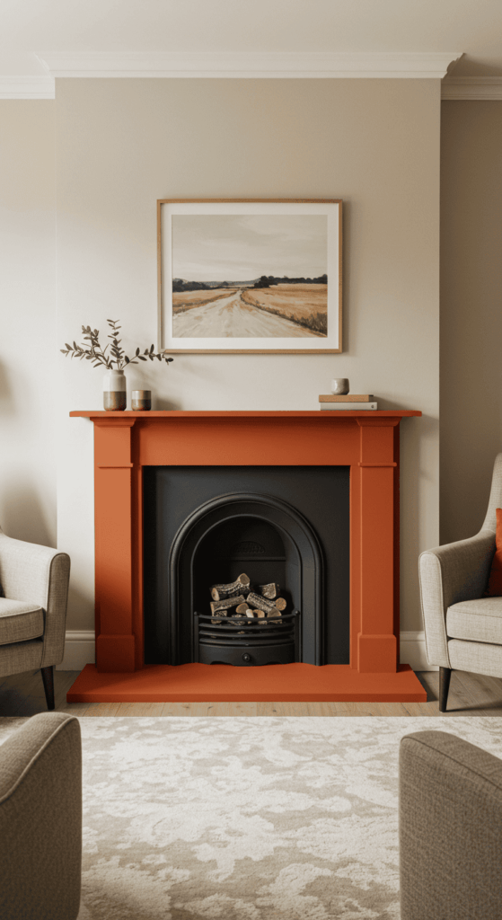
5. Give Your Fireplace Surround a Colorful Makeover
Often the natural focal point of a living room, the fireplace is a prime spot for a color intervention! Instead of the standard brick, stone, or white-painted wood, consider giving the fireplace surround or mantelpiece a bold coat of paint or even tiling it in vibrant colors.
- Why it works: It instantly elevates the fireplace from a simple architectural element to a stunning design feature. It anchors the seating area and provides a fantastic opportunity to introduce a strong accent color that might feel too overwhelming on a full wall.
- Creative Approaches: You could paint just the mantelpiece a contrasting color, tile the entire surround with colorful ceramic or mosaic tiles, or paint the whole structure (excluding the firebox opening, of course!) in a deep jewel tone or even a cheerful bright hue. Ensure you use appropriate heat-resistant paint if painting areas close to the firebox opening.
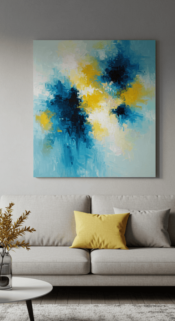
6. Let Artwork Lead the Way
Turn your living room into a personal gallery by making bold, colorful artwork the star of the show. A large abstract painting, a gallery wall of vibrant prints, or even a striking photographic piece can set the entire color scheme for the room.
- Why it works: Art is a deeply personal way to introduce color and express your style. It draws the eye and can tie together different elements in the room.
- Expert Tip: Choose a piece you truly love first, then pull colors from it for your accent pieces like cushions, vases, or even a small side chair. Don’t hang art too high – the center of the piece should be roughly at eye level (around 57-60 inches from the floor).
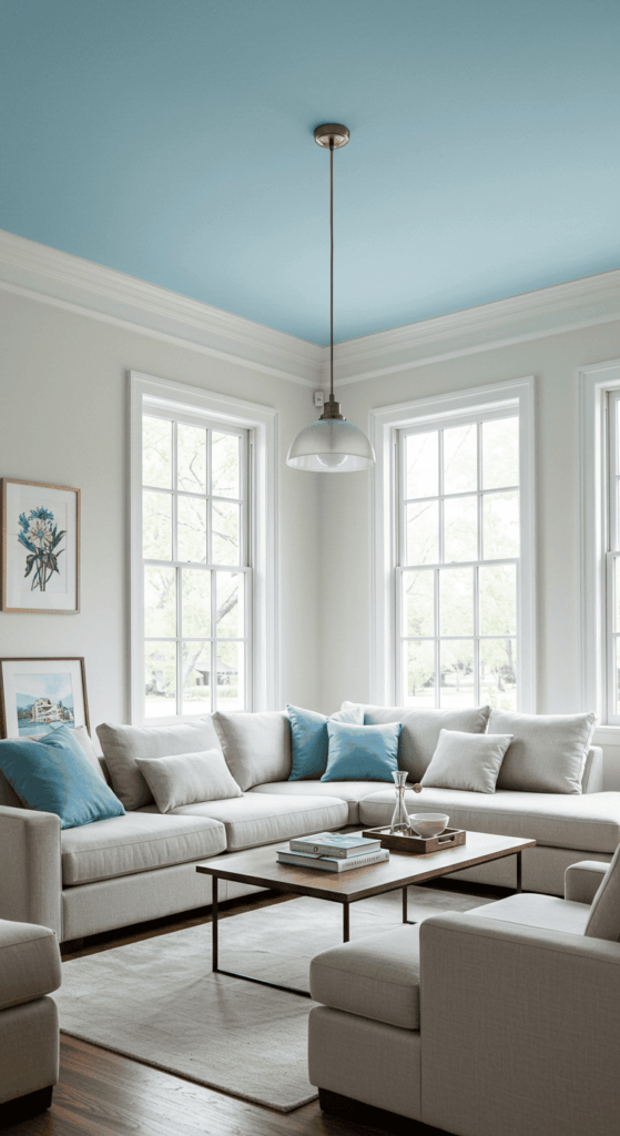
7. Look Up! Paint the Ceiling
Feeling daring? The ceiling – often called the “fifth wall” – is prime real estate for adding an unexpected splash of color. Painting it a soft pastel, a moody deep hue, or even a bright, look-at-me shade can dramatically change the room’s atmosphere.
- Why it works: It draws the eye upward, making the room feel taller (with lighter colors) or cozier and more dramatic (with darker colors). It’s a unique design choice that makes a big statement.
- Design Insight: Lighter ceiling colors (like pale blue or soft yellow) can mimic the sky and feel airy. Darker ceilings (like navy or charcoal) create intimacy but work best in rooms with ample natural light and higher ceilings. Consider a high-gloss finish for a reflective, glamorous effect.
8. Master Monochromatic Magic
Using color doesn’t always mean mixing wildly different hues. A monochromatic scheme, using various tints, tones, and shades of a single color, can be incredibly sophisticated and impactful. Think layered blues, rich greens, or warm terracottas.
- Why it works: It creates a cohesive, harmonious look that feels intentional and calming, yet still visually interesting thanks to the variations in shade and texture.
- Texture is Key: To prevent a monochromatic room from feeling flat, incorporate lots of different textures. If you choose blue, mix velvet, linen, knitted throws, glossy ceramics, and matte finishes all within the blue family.
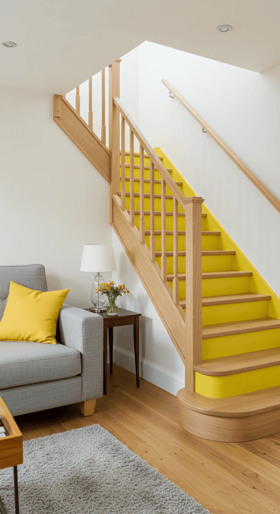
9. Add Vertical Zing with Painted Stair Risers
If your living room connects to or overlooks a staircase, don’t miss this creative color opportunity! Painting the stair risers (the vertical part of each step) adds an unexpected and playful burst of color that draws the eye upward.
- Why it works: It’s a unique detail that adds personality without overwhelming the space. It provides a vertical element of visual interest and can cleverly link the color scheme between different floors or levels of your home, especially in open-concept layouts.
- Design Ideas: You could paint all risers a single, bold accent color pulled from your living room decor. For a more whimsical look, try painting each riser a different shade in an ombré effect or create a subtle pattern. Use durable floor or porch paint for longevity, and keep the treads (the part you step on) a neutral wood or coordinating color for balance.
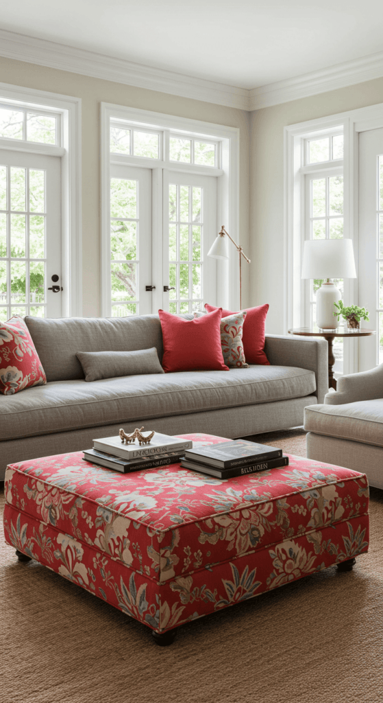
10. Anchor Your Space with a Bold Ottoman or Coffee Table
Think beyond the sofa for your main color statement! A large, eye-catching ottoman or coffee table in a vibrant hue or striking pattern can serve as the colorful centerpiece of your living room seating area.
- Why it works: It anchors the conversation zone beautifully and provides a significant splash of color without the commitment (or cost) of a brightly colored sofa. It’s functional too – offering a place for feet, drinks (with a tray), or even extra seating.
- Styling Savvy: Consider texture as well as color. A plush velvet ottoman in emerald green adds luxury, while a durable patterned fabric in geometric shapes brings energy. For coffee tables, think a sleek design painted in a high-gloss primary color or a reclaimed wood piece with colorful painted accents. Balance this central piece by keeping the surrounding large furniture (like sofas) more neutral, then pull accent colors from the ottoman/table for smaller items like throws or vase groupings.
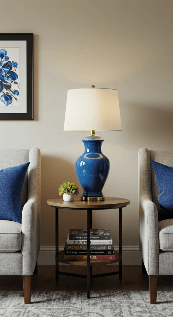
11. Illuminate with Colorful Lighting Fixtures
Make your lighting work double duty by choosing fixtures that add color even when switched off. Think pendant lights with colorful shades, table lamps with vibrant ceramic bases, or even floor lamps in bold finishes.
- Why it works: Lighting fixtures are natural focal points. Using a colorful one draws attention and adds personality, enhancing the overall design scheme both day and night.
- Consider the Glow: Remember that the color of the shade can influence the color of the light emitted. A yellow shade will cast a warm glow, while a blue shade might cast a cooler light. Choose accordingly based on the mood you want to create.
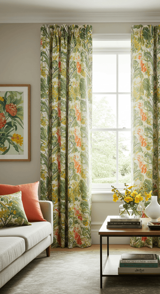
12. Play with Patterned Window Treatments
Your windows are a fantastic opportunity to showcase color and pattern! Swap out plain blinds or neutral drapes for curtains or Roman shades featuring bold prints, vibrant solids, or interesting textures in eye-catching hues.
- Why it works: Window treatments frame your view and occupy significant visual space. Using color or pattern here makes a huge impact, tying the room together and adding softness or drama.
- Smart Selection: Consider the room’s light levels. Sheer colorful curtains add a subtle wash of color while letting light filter through. Heavier patterned drapes make a bolder statement and offer more light control and insulation. Ensure the pattern scale complements other patterns in the room.
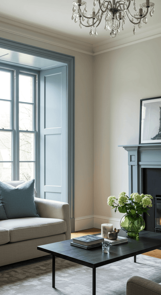
13. Introduce Color Through Trim and Moldings
For a subtle yet sophisticated touch, consider painting your window frames, door frames, baseboards, or crown molding in a contrasting or complementary color instead of the standard white.
- Why it works: It highlights the room’s architectural details and adds an unexpected layer of color and definition. It’s a custom look that feels thoughtful and high-end.
- Color Choice: A soft grey-blue trim against white walls adds a coastal feel. A darker charcoal or even black trim creates a modern, graphic look. For a bolder approach, try a color pulled from your rug or artwork, like a deep green or terracotta. A semi-gloss finish is usually best for trim as it’s durable and easy to clean.
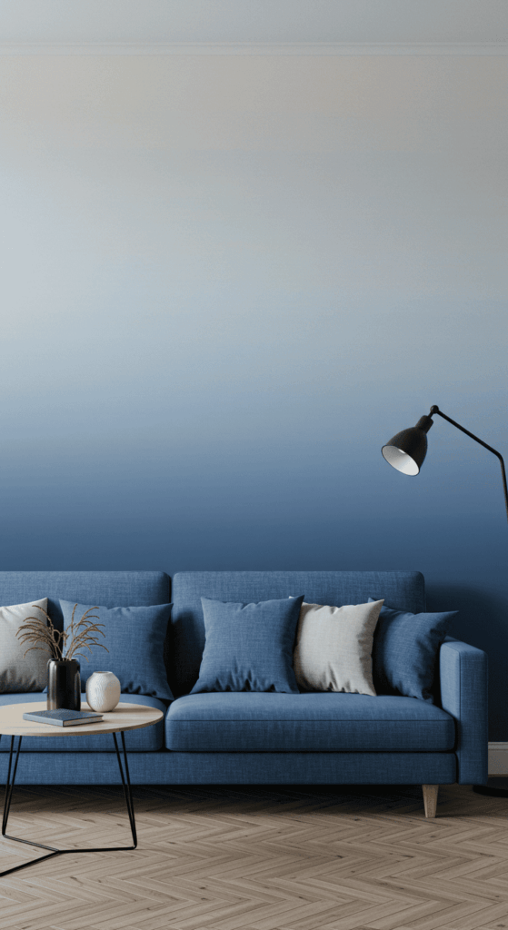
14. Embrace Ombré or Dip-Dye Effects
Add a trendy and artistic touch with ombré (gradual color fading) or dip-dye effects on walls, furniture, or textiles. Imagine a wall fading from deep teal to pale aqua, or curtains dipped in a vibrant hue.
- Why it works: It’s a visually dynamic way to introduce multiple shades of a color, creating depth and a unique, hand-crafted feel. It feels softer than harsh color blocks.
- DIY Potential: While you can buy ombré items, walls offer a great DIY project (though practice is recommended!). For textiles like cushion covers or throws, DIY dip-dyeing is relatively easy and allows for total customization. Start subtle if you’re unsure.
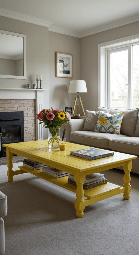
15. Get Playful with Painted Furniture
Give tired furniture a new lease on life with a coat of colorful paint! A brightly painted coffee table, side table, bookshelf, or even the legs of an armchair can become a fun and quirky focal point.
- Why it works: It’s a budget-friendly way to add a bespoke piece and a pop of color exactly where you want it. It allows you to upcycle existing pieces or personalize inexpensive finds.
- Prep is Key: For a lasting finish, proper preparation (sanding, priming) is crucial. Consider chalk paint for a matte, vintage look that often requires less prep, or a high-gloss enamel for a modern, durable finish. Choose a color that complements your overall scheme but provides a noticeable contrast.
16. Use Colorful Glassware and Ceramics
Don’t underestimate the power of small decorative objects! Groupings of colorful glass vases, shapely ceramic vessels, or decorative bowls on shelves, mantels, or coffee tables can add jewel-like pops of color.
- Why it works: These items catch the light beautifully and allow you to introduce intense or unusual colors in small, manageable doses. They add personality and a curated feel.
- Group for Impact: A single small colored vase might get lost, but a collection of 3 or 5 pieces in varying heights and shapes but similar colors (e.g., different shades of blue glass) creates a much stronger visual statement. Play with transparency and opacity.
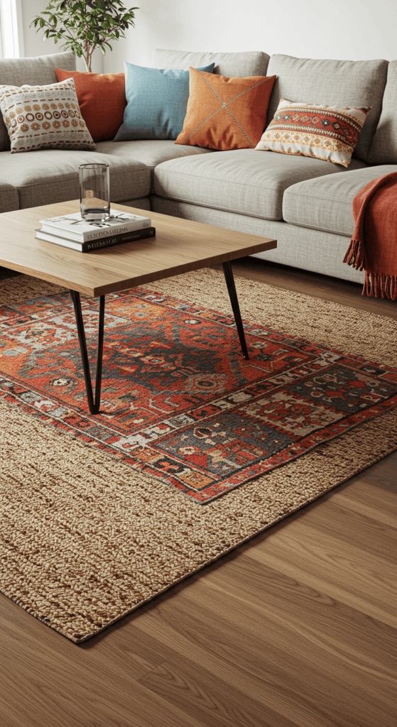
17. Layer Rugs for Color and Texture
Why stop at one rug? Layering a smaller, more colorful or patterned rug over a larger, neutral base rug (like jute or sisal) adds depth, warmth, and a fantastic opportunity to play with color combinations.
- Why it works: It adds significant visual interest and texture to the floor. It allows you to incorporate a bolder rug without committing to covering the entire floor space with it. It also helps define specific zones, like the main seating area.
- Placement Pointers: Ensure the top rug is significantly smaller than the base rug. Placing it slightly off-center or at an angle can create a more relaxed, eclectic look. Make sure the colors and styles complement each other – a vintage colorful rug over a neutral jute rug is a classic combo.
18. Strategically Style Your Throw Pillows
We mentioned pillows earlier (#3), but let’s dive deeper. Don’t just toss them randomly! Arrange your colorful cushions with intention to create visual rhythm and impact. Think symmetry, intentional asymmetry, or color blocking right on your sofa.
- Why it works: A curated pillow arrangement looks polished and purposeful. It allows you to combine multiple colors and patterns from your scheme in a concentrated, eye-catching way.
- Styling Formula: Try this: Start with two matching larger pillows (maybe a solid color or subtle texture) at each end of the sofa. Layer two slightly smaller, complementary patterned pillows in front of those. Finish with a single, standout lumbar pillow in the center, perhaps with a unique texture or boldest color/pattern. Mix solids, patterns, and textures for richness.
19. Tint the Mood with Smart Lighting
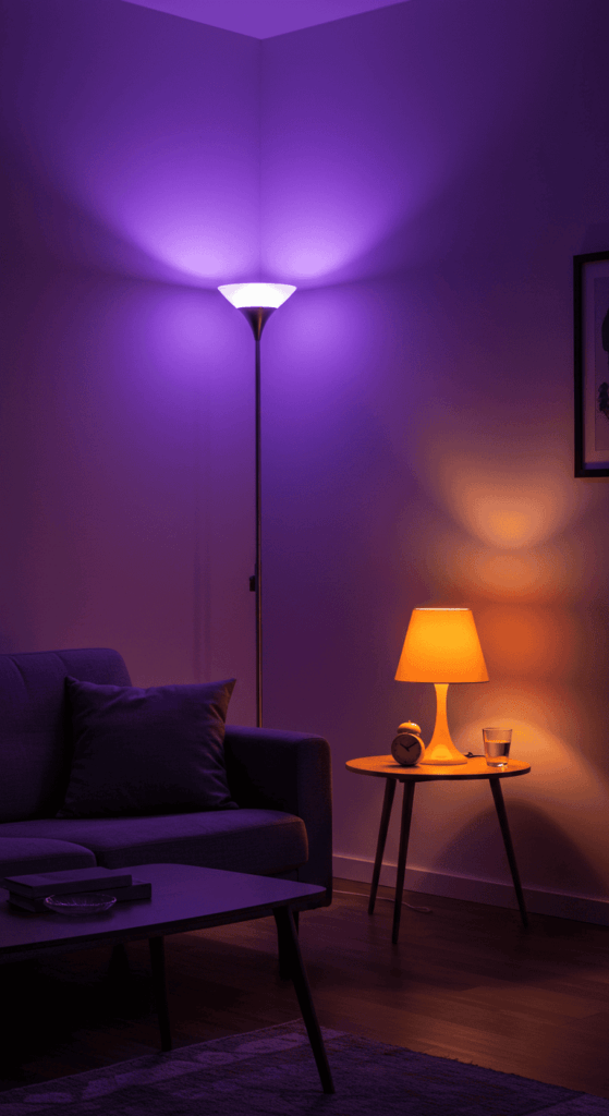
Take colorful lighting to the next level with smart bulbs. These innovative bulbs allow you to change the color and intensity of your lighting with an app or voice command, instantly transforming the room’s ambiance.
- Why it works: It offers ultimate flexibility! You can have bright white light for reading, a warm golden glow for relaxing, or even bathe the room in vibrant blues, pinks, or greens for parties or movie nights. It’s color on demand!
- Smart Application: Use smart bulbs in key lamps – perhaps a floor lamp washing a corner wall or table lamps on side tables. You can program different “scenes” for various activities or moods. It’s a modern, dynamic way to incorporate color without physical changes.
20. Organize Beautifully with Colorful Storage
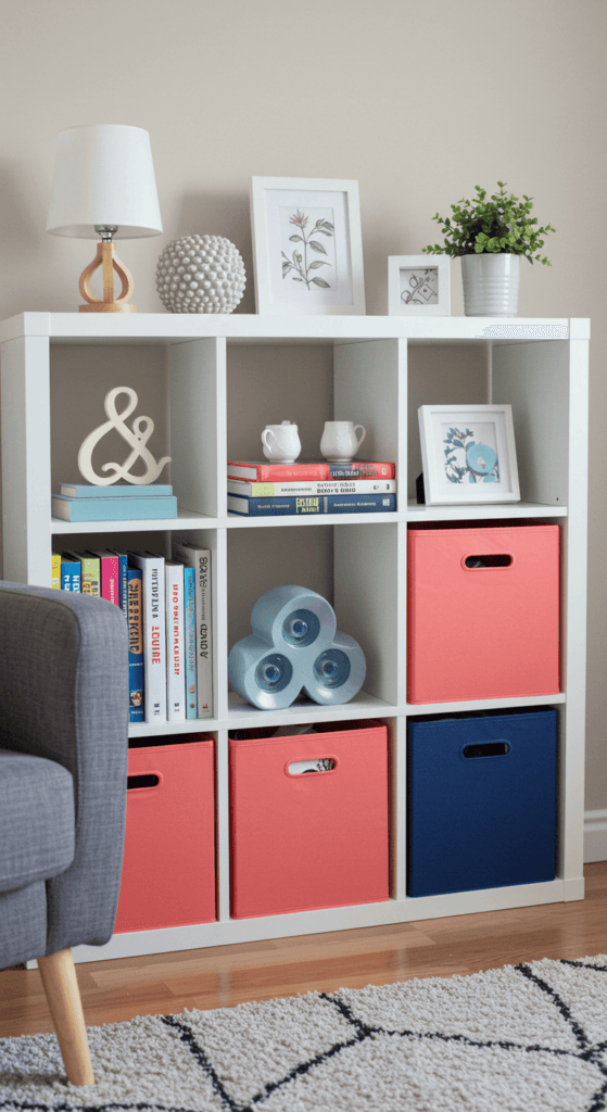
Who says storage has to be boring? Integrate color by choosing baskets, bins, boxes, or even shelving units in vibrant hues. Use them on bookshelves, under coffee tables, or within open console units.
- Why it works: It’s a practical way to add color while keeping clutter at bay. Colorful storage can break up neutral expanses on shelves or provide functional pops of color around the room.
- Coordinate or Contrast: Choose storage containers that either coordinate with your existing accent colors for a cohesive look or contrast boldly for a playful statement. Woven baskets dyed in bright colors add texture too! Think teal blue bins on a white bookshelf or a mustard yellow storage ottoman.
21. Heat Up Your Style: Paint Your Radiator!
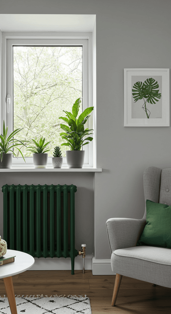
Yes, you read that right! Radiators are often overlooked, purely functional elements in a room. But why let them fade into the background (or stick out unattractively) when they could be a cool, quirky design feature? Painting your radiator in a bold, unexpected color turns a necessity into a stylish statement.
- Why it works: It’s a totally unique way to introduce color that most people don’t consider. It adds an industrial-chic or playful vibe, depending on the color chosen, and cleverly integrates a functional piece into your overall interior design scheme.
- Painting Pointers: Make sure the radiator is off and completely cool before you start. Clean it thoroughly! Use a specialized heat-resistant radiator paint (available in many colors and finishes, including spray paint options for easier application on intricate designs). Choose a color that contrasts dramatically with your walls for a real pop, or select a shade that coordinates with other accents for a more cohesive look. Think mustard yellow, deep teal, or even a sleek matte black!
Ready to Paint Your World?
Whew! From subtle pops to full-blown rainbows, there are countless ways to bring colorful living room ideas to life. Remember, your home should be a reflection of you, so don’t be afraid to experiment and find the colors that make you happy.
Whether you start small with a few vibrant cushions or go bold with a painted ceiling, adding color is one of the most effective ways to totally transform your space. It injects energy, personality, and pure joy – and who doesn’t want more of that?
So, which idea sparked your imagination first? Go ahead, pick your palette and start splashing some color into your life! Happy decorating!


