Ready to break free from boring neutrals? Red kitchen cabinets add bold personality and timeless flair to your space. Whether you love deep wine tones or vibrant scarlets, red brings warmth, energy, and unforgettable style. From modern to rustic, discover how to make this daring hue work beautifully in your kitchen.
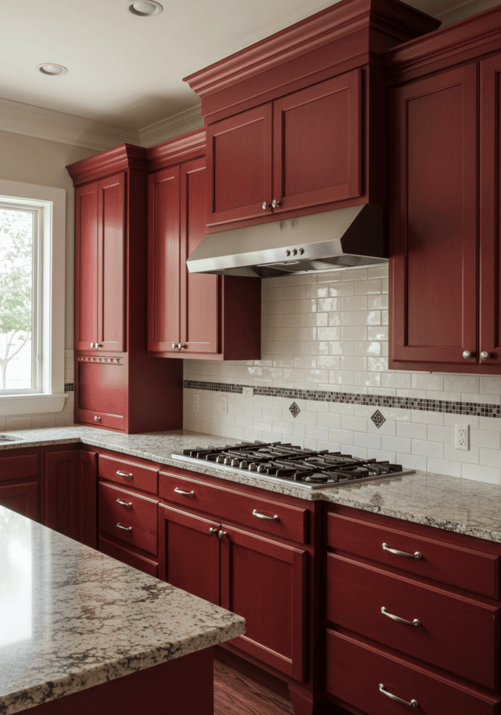
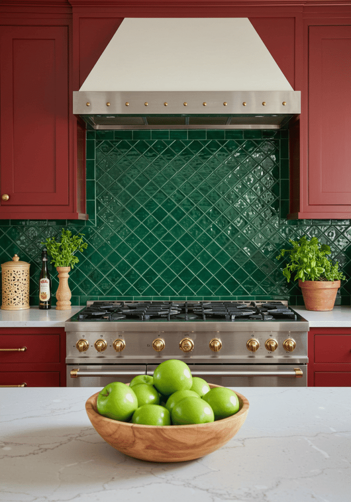
1. Classic Cherry Red: Timeless Elegance & Warmth
Why we love it: Cherry red is the sophisticated older sibling in the red family. It’s rich, warm, and brings an instant feeling of established elegance to any kitchen. This shade has a beautiful depth, often with subtle brown undertones, making it feel luxurious without being overpowering.
Get the look:
- Shade: Think deep, polished cherry wood or a high-quality paint finish in a similar hue.
- Style: Perfect for traditional, transitional, or even farmhouse kitchens. It pairs beautifully with detailed cabinet fronts, like Shaker or raised panel styles.
- Pair it with: Creamy white or beige quartz countertops, a classic subway tile backsplash, and brushed nickel or antique brass hardware. Consider glass-fronted upper cabinets to break up the richness and showcase beautiful dishware.
- Expert Tip: To prevent a cherry red kitchen from feeling too dark, ensure ample natural light or incorporate a robust kitchen lighting ideas plan with under-cabinet, pendant, and ambient lighting.
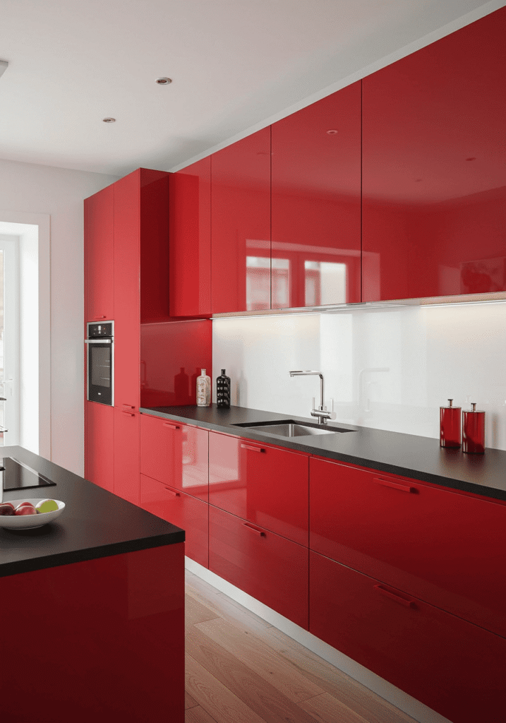
2. Bold Scarlet: A Modern, Energetic Statement
Why we love it: If you’re looking to make a truly fearless statement, scarlet red is your go-to. This vibrant, fiery hue is full of energy and life, instantly creating a focal point that’s impossible to ignore. It’s the perfect choice for a contemporary or modern kitchen ideas design that craves a pop of personality.
Get the look:
- Shade: A true, bright, and unapologetic red – think a classic Ferrari or a ripe tomato. High-gloss finishes can amplify its modern appeal.
- Style: Ideal for modern, contemporary, or minimalist kitchens. Flat-panel or slab-style cabinets work best to let the color do the talking.
- Pair it with:
- Crisp white or cool gray countertops (think Caesarstone or Corian).
- A sleek stainless steel or back-painted glass backsplash.
- Minimalist hardware, like slim bar pulls or even handleless push-to-open mechanisms.
- Expert Tip: Use scarlet red strategically. It can be stunning on all cabinets in a smaller kitchen or as an accent, perhaps just on the lower cabinets or an island, balanced by more neutral tones elsewhere. This prevents the boldness from becoming overwhelming.
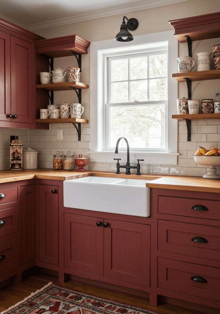
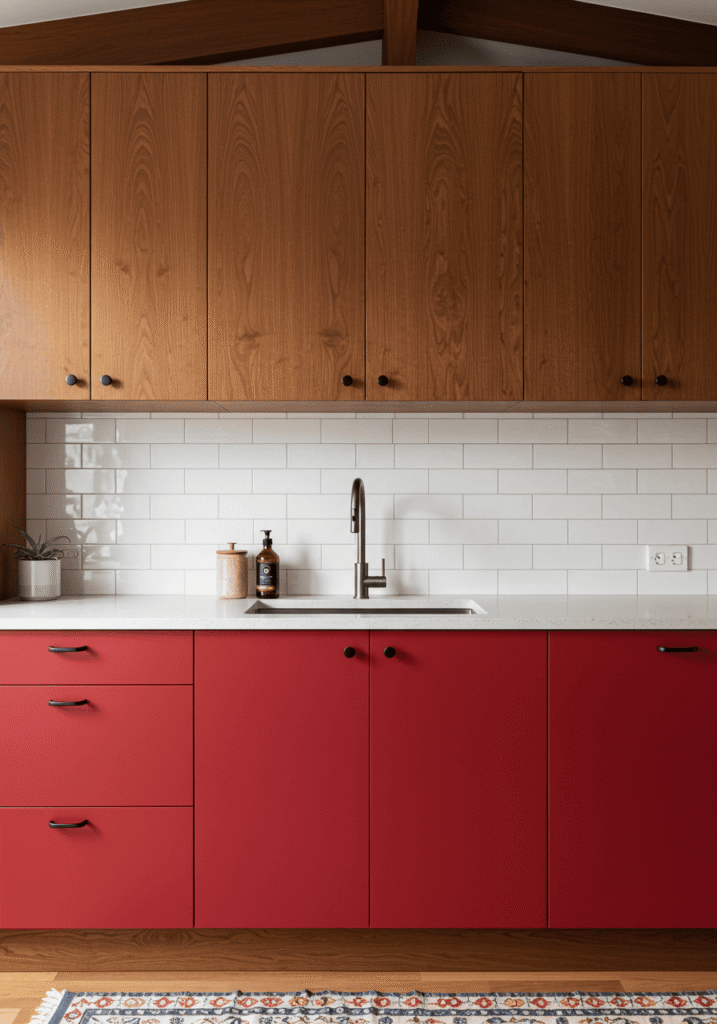
3. Rustic Barn Red: Warmth, Charm & Character
Why we love it: For a kitchen that feels like a warm hug, look no further than barn red. This more muted, earthy red has a wonderfully aged and welcoming feel. It evokes cozy farmhouses, heritage charm, and a sense of lived-in comfort, making it perfect for creating a truly inviting culinary space.
Get the look:
- Shade: A desaturated, slightly dusty red, often with a hint of brown or orange. A matte or distressed finish enhances its rustic appeal.
- Style: Absolutely perfect for farmhouse, rustic, country, or even .
- Pair it with:
- Butcher block or soapstone countertops.
- Beadboard or reclaimed wood backsplash.
- A classic apron-front sink.
- Wrought iron or antique brass hardware.
- Expert Tip: Don’t be afraid to mix barn red cabinets with other natural materials. Exposed wooden beams, oak kitchen cabinets as accent pieces, or stone accents will complement the rustic vibe beautifully. Open shelving displaying vintage crockery can also enhance this style.
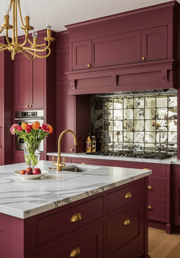
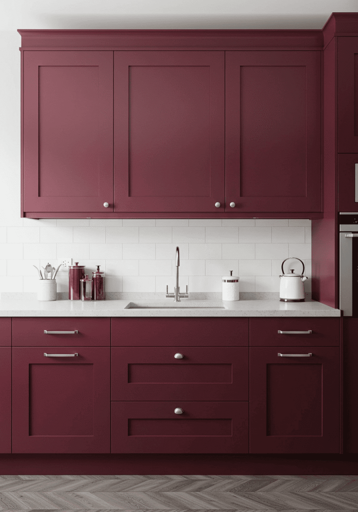
4. Deep Wine Red: Luxurious & Sophisticated Sip
Why we love it: Oh, the opulence! Deep wine reds, like burgundy or merlot, bring an undeniable sense of luxury and depth to a kitchen. These shades are dramatic yet refined, creating a space that feels both intimate and grand. They are perfect for those who appreciate a touch of grown-up glamour. This falls into the beautiful category of dark kitchen cabinets that offer a rich, enveloping feel.
Get the look:
- Shade: Think of a full-bodied Cabernet Sauvignon or a rich, velvety Merlot. These reds have deep purple or brown undertones.
- Style: Excellent for traditional, transitional, or even opulent modern kitchens. They pair well with more ornate cabinet details or sleek, unadorned modern lines if you want a bolder statement.
- Pair it with:
- Marble countertops (Calacatta Gold or a dramatic black marble).
- A reflective backsplash, perhaps in antique mirror tiles or a glossy, dark tile.
- Brass or gold hardware to enhance the luxurious feel.
- Consider dark wood floors or rich, patterned kitchen flooring ideas to complement the depth.
- Expert Tip: Wine red cabinets can make a space feel smaller if not balanced. Use reflective surfaces, statement lighting, and perhaps glass-fronted cabinets for some uppers to maintain an open feel. High ceilings also help carry this dramatic color.
5. Playful Poppy Red: A Burst of Cheerful Energy
Why we love it: If scarlet feels a tad too intense but you still crave a bright, happy red, then poppy red is your perfect match! It’s a cheerful, optimistic hue that’s slightly softer and more orange-toned than a true scarlet. It injects fun and vibrancy without being overwhelming, making your kitchen feel instantly more welcoming.
Get the look:
- Shade: A bright, clear red with a hint of orange, like a field of poppy flowers in the summer sun.
- Style: Fantastic for eclectic, mid-century modern, or even contemporary farmhouse kitchens. It’s playful enough for more whimsical designs.
- Pair it with:
- Light wood countertops (like maple or birch) or crisp white laminate.
- A fun patterned tile backsplash (think geometric or floral).
- Unique hardware – perhaps ceramic knobs or quirky brass pulls.
- Consider open shelving to display colourful accessories.
- Expert Tip: Poppy red looks amazing when paired with cool blues or teals for a complementary colour scheme, or with yellows and oranges for an analogous, fiery vibe. Use it on a feature wall of cabinets or an island to make a statement in your kitchen decorating ideas.
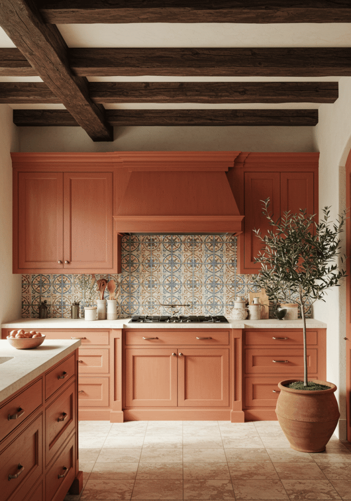
6. Earthy Terracotta Red: Warmth of the Sun-Drenched Earth
Why we love it: Terracotta brings a beautiful, sun-baked warmth to the kitchen. This earthy, muted red with distinct orange and brown undertones evokes Mediterranean villas and Southwestern charm. It’s grounding, inviting, and connects your kitchen to the natural world, making it a perfect choice for a rustic kitchen.
Get the look:
- Shade: A matte, clay-like red-orange. Think fired earth, ancient pottery.
- Style: Perfect for Mediterranean, Southwestern, rustic, or bohemian style kitchens.
- Pair it with:
- Natural stone countertops like travertine or slate, or even concrete.
- Handmade-look tiles for the backsplash (Zellige or Talavera).
- Textured elements: woven baskets, terracotta pots, exposed wooden beams.
- Aged brass or oil-rubbed bronze hardware.
- Expert Tip: Enhance the earthy feel by incorporating plants and natural textiles. Terracotta red cabinets pair beautifully with other warm tones, as well as cooler accents like turquoise or sage green for a balanced look.
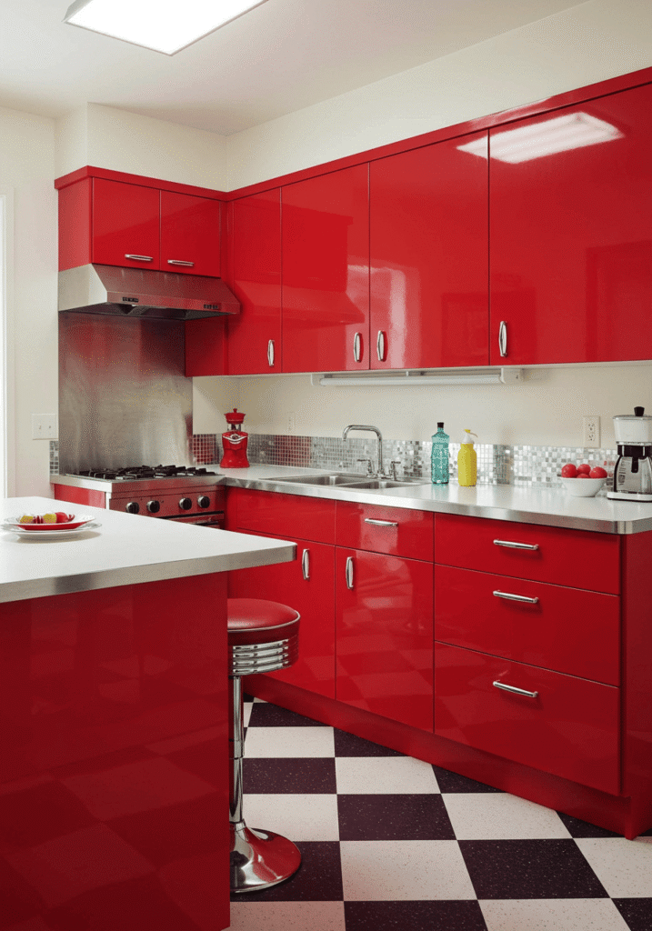
7. Retro Diner Red: Nostalgic & Fun-Loving
Why we love it: Ready for a blast from the past? This vibrant, glossy red is pure, unadulterated fun! It instantly transports you to a classic 1950s diner, full of rock ‘n’ roll energy and playful charm. If you love vintage style and want a kitchen that’s a real conversation starter, this is the red for you. It’s a cornerstone of any authentic retro kitchen.
Get the look:
- Shade: A bright, high-gloss, cherry-coke red. Think classic diner booths and vintage appliances.
- Style: Ideal for retro, vintage, or rockabilly-inspired kitchens.
- Pair it with:
- Laminate countertops with a chrome edge, or even a black and white checkerboard pattern.
- A simple white subway tile backsplash or stainless steel sheeting.
- Lots of chrome accents: hardware, edging, appliance details.
- Consider a black and white checkered floor for the full effect.
- Expert Tip: Don’t be afraid to go all-in with retro accessories! Vintage-style toasters, blenders, and canister sets in complementary colours like turquoise or sunny yellow will complete the look. Keep the lines of the cabinets simple and clean to let the colour and accessories shine.
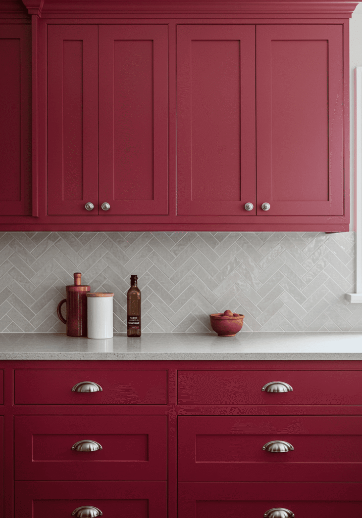
8. Sophisticated Cranberry Red: A Touch of Muted Elegance
Why we love it: Cranberry red offers a beautifully sophisticated take on red. It’s less assertive than a true scarlet but richer than a barn red, sitting in a delightful sweet spot of grown-up elegance. This shade has a subtle blue or purple undertone, giving it a cool, composed feel that’s perfect for a refined kitchen atmosphere. It’s a wonderful option if you’re exploring various kitchen cabinet color ideas but want something unique yet timeless.
Get the look:
- Shade: A deep, slightly muted red with cool undertones, like fresh cranberries or a rich raspberry. A satin or low-sheen finish works beautifully.
- Style: Ideal for transitional, traditional, or even sophisticated country kitchens. It pairs well with classic cabinet door styles.
- Pair it with:
- Creamy or soft grey quartz countertops.
- A subtle marble mosaic or ceramic tile backsplash in a light neutral.
- Polished nickel or antique silver hardware.
- Consider incorporating elements of dark wood for added richness.
- Expert Tip: Cranberry red loves to be paired with soft, muted greens like sage or olive for a complementary color scheme that feels both elegant and grounded. This can be introduced through accessories, wall paint in an adjacent area, or even potted herbs.
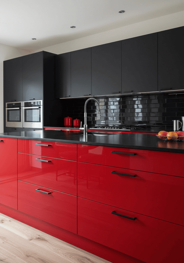
9. Red & Black: A Dramatic, High-Contrast Power Couple
Why we love it: Talk about a showstopper! Pairing red cabinets with black elements creates an undeniably bold, dramatic, and ultra-modern look. This high-contrast combination is sleek, edgy, and exudes confidence. It’s a fantastic choice for those who love a kitchen with a strong, graphic impact. While we adore red here, exploring black kitchen cabinets can offer even more ideas for striking dark themes.
Get the look:
- Shade of Red: A bright, true red or a deep, glossy scarlet works best to stand out against the black.
- Style: Perfect for modern, contemporary, or industrial kitchens.
- Pair it with:
- Black granite or quartz countertops (either matte or polished).
- A black glass backsplash, or even black subway tiles with contrasting white grout.
- Stainless steel or black matte hardware.
- Black appliances for a seamless look.
- Expert Tip: Balance is key with this powerful duo. Consider using red for either the upper or lower cabinets and black for the other, or a red island with black perimeter cabinets. Alternatively, use red cabinets and introduce black through countertops, backsplash, and flooring to ground the space. Good lighting is crucial to prevent it from feeling too cave-like.
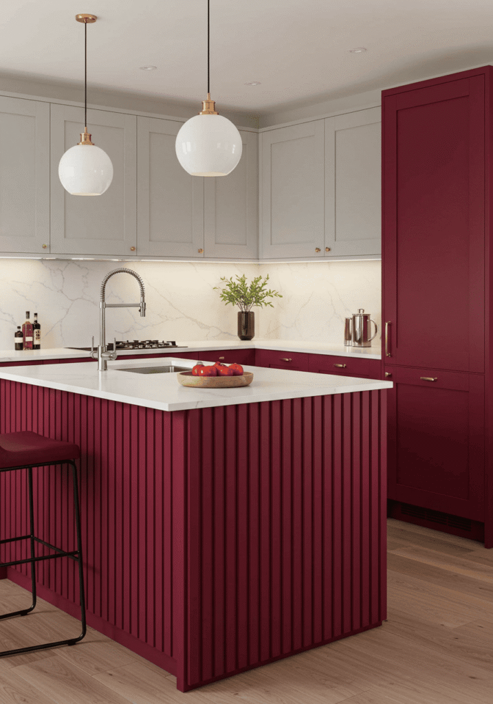
10. Fluted Red Cabinets: Texture, Depth, & Modern Elegance
Why we love it: Texture is taking the design world by storm, and fluted or reeded cabinet fronts are at the forefront of this trend. When applied to red kitchen cabinets, this textural detail adds incredible depth, visual interest, and a sophisticated tactile quality. The vertical lines create a beautiful play of light and shadow, lending an air of bespoke craftsmanship and modern elegance to the space. It’s a subtle yet impactful way to make your red cabinets truly unique.
Get the look:
- Shade of Red: This works beautifully with a range of reds. A matte finish on a deep wine, cherry, or even a muted terracotta red can look exceptionally chic with fluting. Brighter, glossier reds can also work for a more playful, contemporary statement.
- Fluting Style: The ridges can be narrow and delicate or wider and more pronounced. Consider vertical fluting for a sense of height.
- Style: Perfect for modern, contemporary, Art Deco revival, or transitional kitchens. It can even add a sophisticated twist to a mid-century modern kitchen if paired with the right red hue and other design elements.
- Pair it with:
- Smooth, sleek countertops (like polished quartz, marble, or a solid surface) to contrast with the textured cabinets.
- A simple backsplash that doesn’t compete with the cabinet texture – think a large format tile or a solid slab.
- Minimalist hardware, like slim bar pulls or discreet edge pulls, or even go handleless to let the fluting be the star.
- Consider brass or matte black accents for a touch of sophisticated contrast.
- Expert Tip: Use fluted red cabinets strategically. An entire kitchen in fluted red might feel too busy for some. Consider them for a feature wall of cabinets, the kitchen island, or just the upper or lower cabinets to create a stunning focal point. Ensure your lighting plan accentuates the beautiful shadows and highlights created by the ridges.
11. Red with Warm Wood Tones: A Harmonious Blend of Bold & Natural
Why we love it: Combining the vibrancy of red cabinets with the natural warmth of wood creates a beautifully balanced and inviting kitchen. The wood tones help to ground the red, adding texture and a touch of rustic or organic charm, depending on the wood chosen. This pairing feels both exciting and comforting. It’s a great way to incorporate a bold color while still keeping the space feeling cozy, especially if you’re a fan of the character found in hickory kitchen cabinets or other distinct wood grains.
Get the look:
- Shade of Red: Almost any red can work, from a muted barn red to a brighter scarlet.
- Wood Tones: Light woods like maple or birch create a fresh, Scandinavian feel. Medium woods like oak or cherry add classic warmth. Darker woods like walnut offer a sophisticated contrast.
- Style: Versatile enough for rustic, modern farmhouse, mid-century modern, or even eclectic kitchens.
- Pair it with:
- Countertops that complement both the red and the wood – light quartz, soapstone, or even a contrasting wood like butcher block on an island.
- A simple tile backsplash or one that incorporates natural stone.
- Hardware that bridges the two elements, like matte black or antique brass.
- Expert Tip: Consider using red for a section of cabinets (like an island or a bank of uppers/lowers) and wood for the rest. Or, use red cabinets and introduce wood through open shelving, countertops, flooring, or even a feature ceiling detail. The key is to create a pleasing dialogue between the color and the natural material.
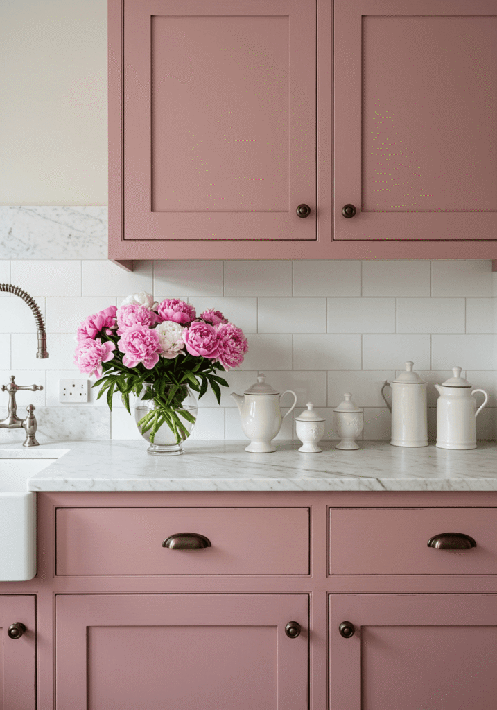
12. Muted Rose Red: Soft, Romantic & Subtly Chic
Why we love it: Not all reds need to shout! Muted rose red offers a softer, more romantic take on the trend. It has dusty, slightly desaturated undertones, sometimes leaning towards a deep, sophisticated pink. This shade is perfect for creating a kitchen that feels elegant, inviting, and subtly feminine without being overtly saccharine. It’s a beautiful bridge if you like the idea of a pink kitchen but want something with a bit more depth and warmth.
Get the look:
- Shade: A soft, dusty red with pink or mauve undertones. Think of dried rose petals or a sun-faded vintage velvet. A matte or satin finish enhances its understated charm.
- Style: Wonderful for shabby chic, vintage, romantic, or even modern farmhouse kitchens with a softer edge.
- Pair it with:
- Light marble or granite countertops with delicate veining.
- A classic white subway tile or a subtly patterned ceramic backsplash.
- Antique brass, brushed gold, or even crystal knobs for a touch of glamour.
- Soft, flowing window treatments and delicate accessories.
- Expert Tip: Pair muted rose red cabinets with creamy whites, soft greys, and natural wood tones to maintain a light and airy feel. Floral patterns in textiles or artwork can beautifully complement this shade.
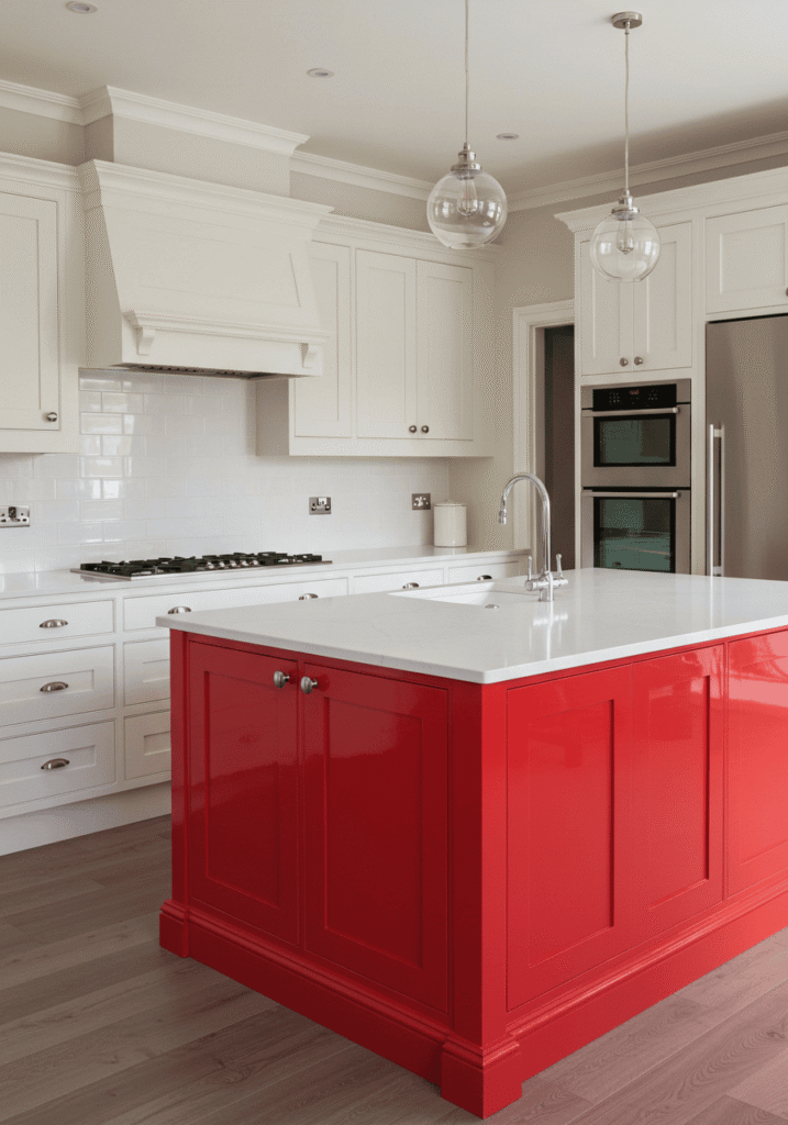
13. Red as an Accent: Island or Feature Wall Power
Why we love it: Still a little hesitant to go all-red? No problem! Using red as a powerful accent is a fantastic way to dip your toes into this vibrant color. A red kitchen island can become an instant focal point, or a single wall of red cabinets can add a dramatic punch without overwhelming the entire space. This strategy allows you to experiment with bolder kitchen cabinet color ideas in a more controlled way.
Get the look:
- Shade of Red: Any shade can work, depending on the impact you want. A bright scarlet will be a bold statement, while a deeper wine red will feel more sophisticated.
- Main Cabinets: Keep the surrounding cabinets in a neutral hue like white, cream, grey (perhaps inspired by gray kitchen cabinets), or even a light wood.
- Style: This approach works across all kitchen styles, from ultra-modern to traditional.
- Pair it with:
- Countertops that coordinate with both the red accent and the main cabinet color.
- A backsplash that ties the look together, perhaps with subtle red accents or a neutral that allows the red to pop.
- Expert Tip: Ensure the red accent feels intentional and balanced. If it’s an island, consider repeating the red in small accessories elsewhere, like a vase, artwork, or even barstool cushions, to create a cohesive look.
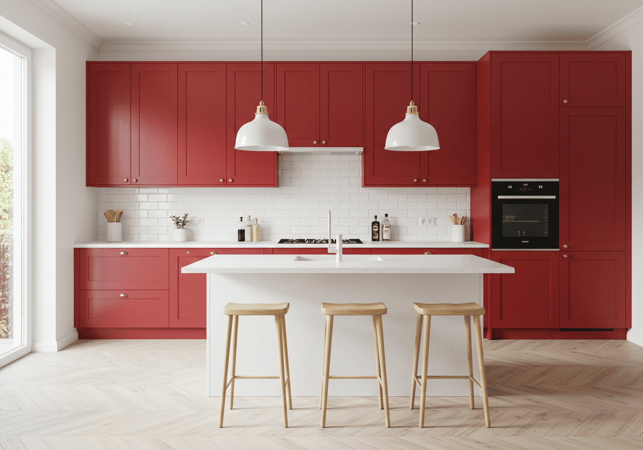
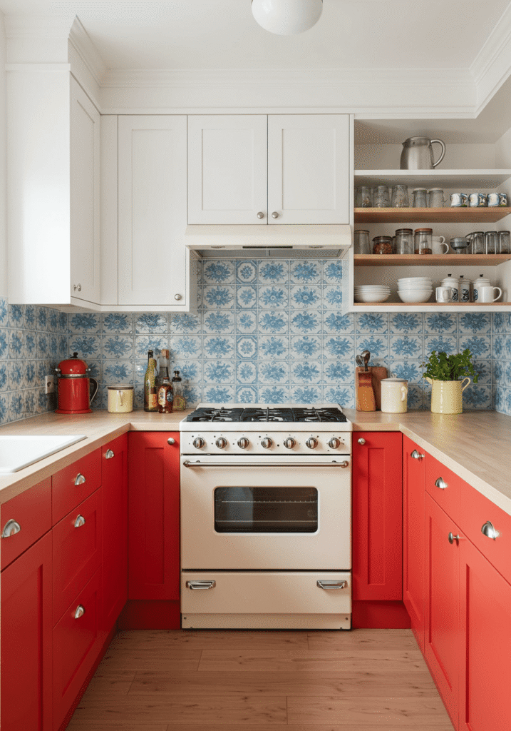
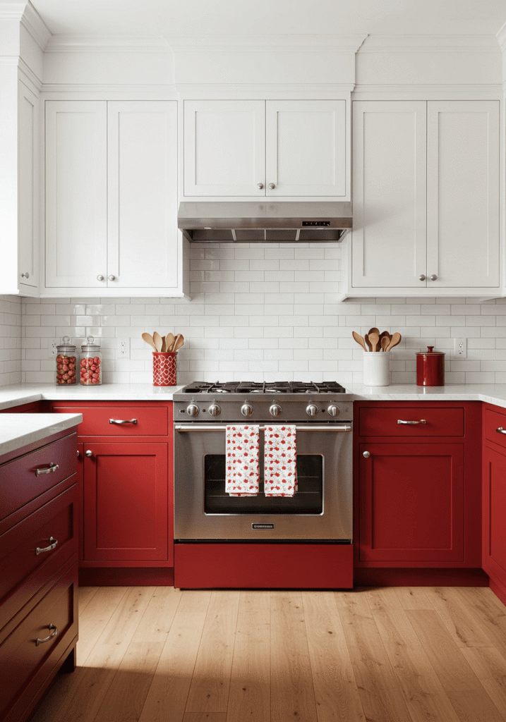
14. Red & White: Classic, Crisp, & Clean Contrast
Why we love it: The combination of red and white is a timeless classic for a reason. It’s crisp, clean, and offers a bright, energetic feel. The white acts as a perfect foil to the red, preventing it from becoming too heavy and ensuring the space feels airy and open. This duo is incredibly versatile and can be adapted to various styles.
Get the look:
- Shade of Red: Bright, clear reds like cherry or scarlet work particularly well to create a strong, cheerful contrast with the white.
- Style: Adaptable to modern, retro, traditional, or even Scandinavian kitchens.
- Pair it with:
- White countertops (quartz, laminate, or even white-painted wood).
- A white backsplash (subway tiles, beadboard, or back-painted glass).
- You can alternate red and white cabinets (e.g., red lowers, white uppers) or use red for all cabinets and keep walls, countertops, and backsplash bright white.
- Chrome or brushed nickel hardware often complements this scheme well.
- Expert Tip: Introduce a third accent color in small doses if desired – black for a graphic punch, or a warm wood tone for a touch of softness. Pattern can also be fun here, like a red and white checkered floor for a retro vibe.
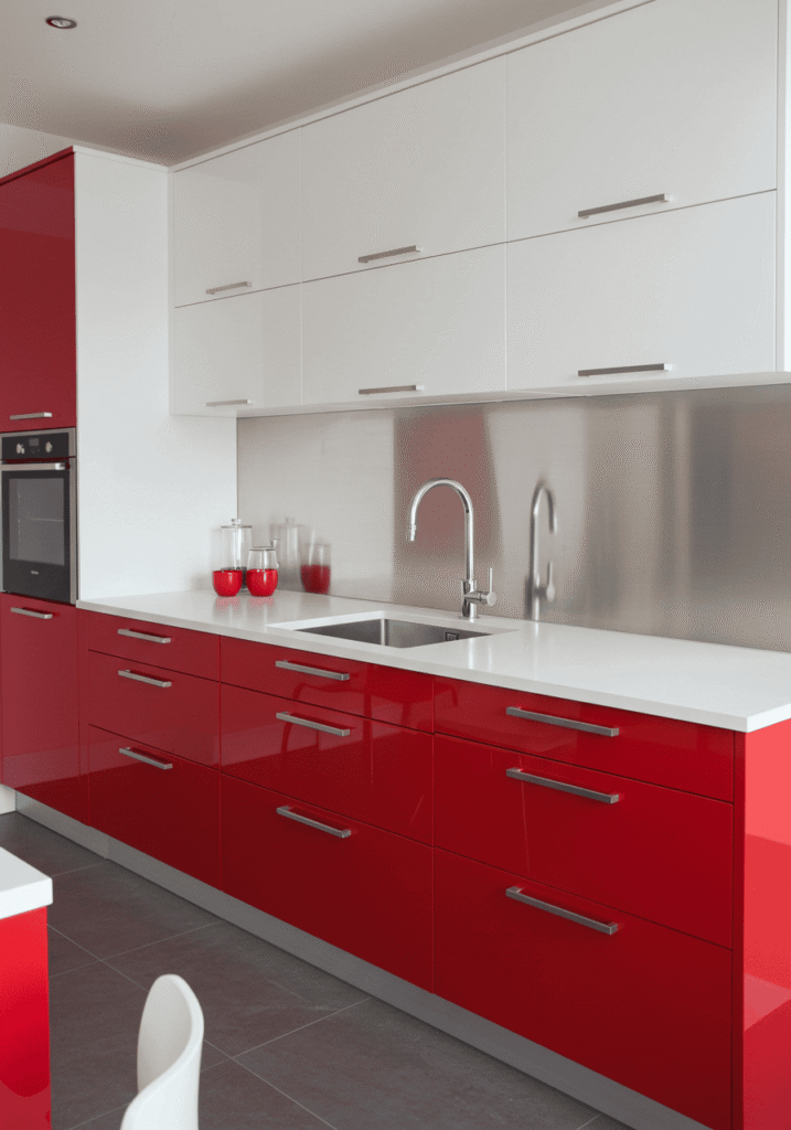
15. Red Lacquer: Ultra-Modern & Reflective Sheen
Why we love it: For the ultimate in sleek, contemporary cool, red lacquer cabinets are unbeatable. The deep, mirror-like finish creates an incredibly luxurious and sophisticated look. Lacquer offers a depth of color and a smooth, seamless surface that is perfect for minimalist designs. This is a top choice for anyone aiming for truly contemporary kitchens.
Get the look:
- Shade of Red: Deep, rich reds like oxblood or a vibrant Ferrari red look stunning in a lacquer finish.
- Style: Exclusively for modern and contemporary kitchens. Best with flat-panel, handleless cabinet designs.
- Pair it with:
- Solid surface countertops in white, black, or a cool grey.
- A seamless backsplash material like back-painted glass, polished stone slab, or stainless steel.
- Integrated appliances to maintain the sleek, uninterrupted lines.
- Minimalist or no hardware (push-to-open mechanisms).
- Expert Tip: Lacquer finishes require careful maintenance to avoid scratches, but their stunning visual impact is often worth the effort. Ensure excellent lighting to fully appreciate the reflective quality and depth of the color. This finish can make a smaller kitchen feel larger and more open.
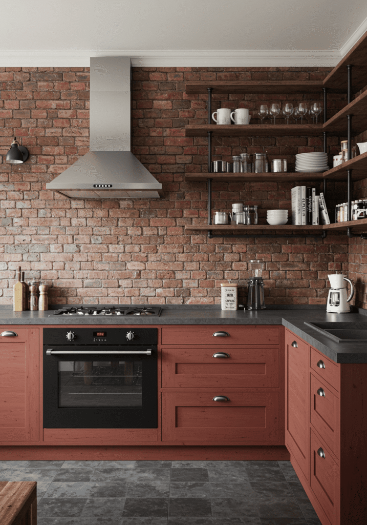
16. Rustic Red with Industrial Touches: Edgy Charm
Why we love it: This combination blends the warmth and character of rustic red with the raw, edgy appeal of industrial design. Think distressed red cabinets meet exposed brick, metal accents, and utilitarian fixtures. It’s a look that’s full of personality, texture, and a story waiting to be told. This style perfectly captures the essence of a rustic modern kitchen.
Get the look:
- Shade of Red: A weathered, distressed barn red or a deeper, muted brick red works best. A matte finish is key.
- Style: Ideal for industrial loft, rustic modern, or eclectic kitchens.
- Pair it with:
- Concrete or dark soapstone countertops.
- Exposed brick or reclaimed wood for a feature wall or backsplash.
- Metal open shelving (black steel or galvanized pipe).
- Industrial-style pendant lights with Edison bulbs.
- Hardware like cast iron pulls or utilitarian knobs.
- Expert Tip: Don’t be afraid to mix materials. The contrast between the warm red, cool metal, and rough textures is what makes this style so compelling. Look for vintage or reclaimed elements to add authenticity.
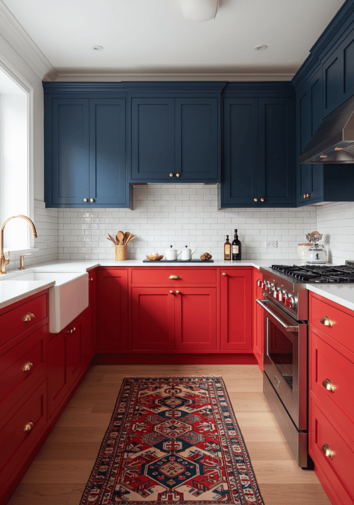
17. Red & Blue: A Bold & Unexpected Pairing
Why we love it: Red and blue together? Absolutely! When done right, this primary color pairing can be surprisingly sophisticated and incredibly dynamic. The key is to choose the right shades and balance their intensity. This combination can create a kitchen that’s vibrant, energetic, and truly unique. For those who love color, exploring options like blue kitchen cabinets in conjunction with red can lead to exciting designs.
Get the look:
- Shades:
- For a nautical or patriotic feel: Bright cherry red with navy blue.
- For a more muted, sophisticated look: Cranberry red with a dusty slate blue.
- For a playful vibe: Poppy red with a bright turquoise.
- Style: Works well in eclectic, modern, coastal, or even traditional kitchens with a bold twist.
- Pair it with:
- Neutral countertops like white or light grey to act as a buffer.
- A simple backsplash that doesn’t compete with the colors.
- Hardware that complements both hues – brushed nickel or even brass.
- Expert Tip: Use one color as the dominant and the other as an accent. For example, red cabinets with a blue island, or red lower cabinets with blue upper cabinets (or vice-versa). Alternatively, use one color for cabinets and the other for a feature wall or significant accessories. Introduce plenty of white or neutral tones to keep the look from becoming overwhelming.
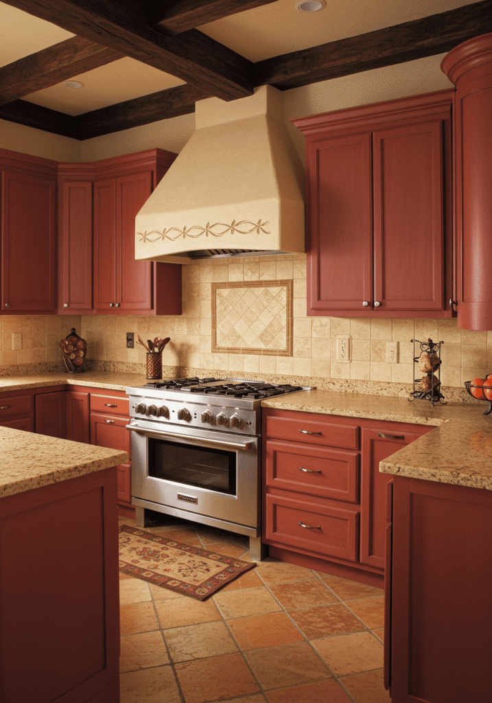
18. Burnt Orange-Red: Earthy, Warm, & Inviting
Why we love it: Leaning towards the warmer side of the spectrum, burnt orange-red is a wonderfully inviting and earthy hue. It carries the energy of red but is tempered with the grounding qualities of orange and brown, reminiscent of autumn leaves or a desert sunset. It creates a cozy, welcoming atmosphere that’s perfect for a family kitchen. This shade shares a similar warmth with some brown kitchen cabinets, offering a rich, organic feel.
Get the look:
- Shade: A deep, warm red with strong orange and brown undertones. Think terracotta’s deeper cousin, or a rich paprika. A matte or satin finish complements its earthy nature.
- Style: Excellent for Southwestern, Mediterranean, rustic, or even bohemian kitchens.
- Pair it with:
- Natural stone countertops like travertine, slate, or a warm-toned granite.
- Textured backsplashes – perhaps handmade tiles, stone, or even a stucco-like finish.
- Dark wood accents, woven textiles, and potted plants.
- Oil-rubbed bronze or aged copper hardware.
- Expert Tip: This color pairs beautifully with other warm neutrals, creams, and deep greens. Embrace texture to enhance its cozy, organic feel. Consider open shelving to display artisanal pottery or rustic cookware.
19. Two-Tone Red: Playing with Shades & Depths
Why we love it: Why settle for one red when you can have two? Using two different shades of red for your cabinets can create a sophisticated, layered look with incredible depth. This could be a darker red for the base cabinets and a lighter, brighter red for the uppers, or even contrasting shades on an island and perimeter cabinets. It’s a subtle way to add visual interest and showcase your confident use of color.
Get the look:
- Shades: Choose reds from the same family but with different intensities (e.g., wine red lowers, cranberry uppers) or reds with slightly different undertones (e.g., a true red island with cherry red perimeter).
- Style: Works best in transitional, contemporary, or modern kitchens where subtle design nuances are appreciated.
- Pair it with:
- Neutral countertops and backsplashes that don’t compete with the nuanced color play.
- Hardware that unifies the look, perhaps in a classic metallic finish.
- Expert Tip: Ensure there’s enough contrast between the two reds to be noticeable, but not so much that they clash. Lighting plays a crucial role here, so make sure your kitchen lighting ideas highlight the different tones effectively. This approach can also help define different zones within the kitchen.
20. Red with Green Accents: A Festive, Complementary Pop
Why we love it: Red and green are complementary colors, meaning they sit opposite each other on the color wheel. This creates a vibrant, energetic, and often festive feel. While it can be reminiscent of holiday decor, when done thoughtfully with the right shades, it can be a stunning and stylish year-round choice. For more on using green, you might explore dark green kitchen cabinets for other areas or as a contrasting element.
Get the look:
- Shades:
- For a classic look: A true red with a forest or emerald green.
- For a more muted, sophisticated feel: Cranberry or wine red with sage or olive green.
- For a playful touch: A poppy red with a mint or apple green.
- Style: Can be adapted to traditional, eclectic, farmhouse, or even modern kitchens depending on the shades and application.
- Pair it with:
- Plenty of neutrals (white, cream, beige, or wood tones) to balance the strong color combination.
- Use one color for cabinets and the other for accents like a backsplash, island, window treatments, or even just fresh herbs and plants.
- Expert Tip: The key is moderation. Don’t let the two colors compete for dominance. If you have red cabinets, introduce green through a tiled backsplash, an accent wall painted in a soft green, or through botanical prints and live plants. Natural wood elements can also help to mediate between the two strong colors.
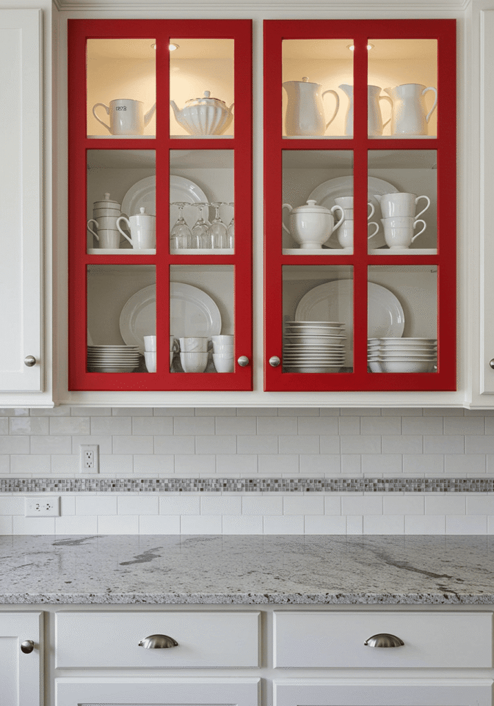
21. Red Framed Glass Cabinets: Showcasing Style with a Pop of Color
Why we love it: Red framed glass-front cabinets offer a wonderful way to incorporate the boldness of red while maintaining a sense of openness and providing an opportunity to display beautiful dishware or collectibles. The red frame acts as a vibrant outline, drawing attention to the contents within and adding a sophisticated pop of color without the visual weight of solid red uppers.
Get the look:
- Shade of Red: Any red can work for the frames, from a bright scarlet for a modern look to a deeper wine red for a more traditional feel.
- Glass: Clear glass, frosted glass, reeded glass, or even seeded glass can be used depending on the desired level of transparency and style.
- Style: Versatile for traditional, transitional, modern, or even farmhouse kitchens.
- Pair it with:
- Lower cabinets in the same red, or a contrasting neutral or wood tone.
- Interior cabinet lighting to highlight the displayed items.
- Coordinated hardware that complements the red frames.
- Expert Tip: What you display inside becomes part of the decor. Curate the contents carefully – stacks of white dishes look crisp, while colorful pottery can add an extra layer of vibrancy. This is a great option for upper cabinets to break up a solid wall of color.
Phew! What a journey through the world of ravishing red! From bold and modern to warm and rustic, it’s clear that red kitchen cabinets offer a spectrum of possibilities to create a kitchen that’s not just a place to cook, but a true reflection of your personality and style.
Remember, choosing a color as dynamic as red is a commitment to creating a space with energy and character. Whether you go all-out with a full suite of crimson cabinets or opt for a strategic pop of scarlet, embracing red is sure to ignite your culinary space and make it the undeniable heart of your home. Happy decorating!